Sunday, August 30, 2009

Phase One: Pillows, Boxes, and Cushions

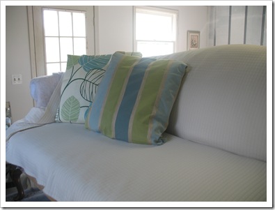
This weekend I began phase one of the Great Den Decorating process.   The new couch is supposed to be finished tomorrow (or possibly is already finished?) and delivered on Tuesday, pending good weather.  So, the past couple of days I have been preparing for its arrival, if you will, by fixing up the pillows that will keep it company for the next few years (or until I grow tired of them).

The three kinds of pillows are:

  1. Leaf pattern 16” square of Sunbrella outdoor fabric
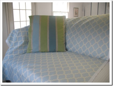
  2. Stripe 16” square of fancy upholstery fabric with braided stripe
  3. Birdie 12” x 20” of blue weaver’s cloth with hand painted bird silhouette

They are now hanging out on the current sofa, waiting for their new friend to arrive:

IMG_9094

IMG_9099

The stripe pillow was inspired by this Pottery Barn pillow cover.  I still have to get a couple of big wooden buttons for the closure on those two.

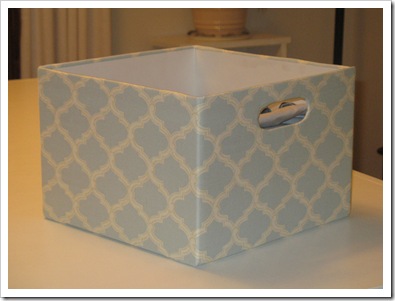
Phase one also included some storage solutions.  I had the idea to create some fabric covered boxes to go in my sewing table cubbies.  I used 12 x 12 cardboard boxes and cut out a little handle.  Then I wrapped the fabric over the box and taped it on the inside and bottom with masking tape (so much easier than glue).  I stitched up the corner where the fabric overlapped and then used spray adhesive to finish the inside with white paper.  You may notice that one of them isn’t finished inside… that’s because I ran out of white paper.  :(

IMG_9103

I filled them with sewing projects that were previously falling out of the shelves in a mess!  Now they look so pretty I moved them to the den side of the room for everyone to see. :)

IMG_9112

I also made a fabric covered box to organize my magazines:

IMG_9110

For this one, I used a tall skinny box and resized it (more masking tape was involved).  Then I cut out a diagonal so you can see what’s inside.

I may have to make some more of these to put on my bookshelf.

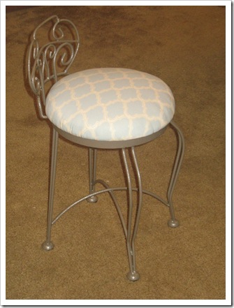
Over the weekend, I also visited my parents and my Mama helped me cover the cushion on my sewing chair.  We added a nice firm piece of foam so I don’t have to put a pillow on top anymore, yay!

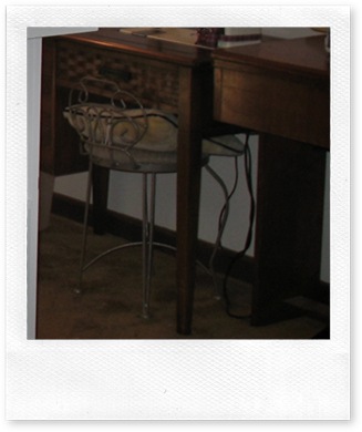
This is what my chair used to look like, poor little squished pillow:

IMG_7386

Here it is with a new, plump cushion!  Very nice.

IMG_9114

That completes phase one.  Now, I am ready for phase two! 

Phase two could be furniture.  Or it could be the awesome upholstered bulletin board that I’m going to make!  Or perhaps the hand painted canvas art pieces? 

We’ll just have to wait and see!

signature

Friday, August 28, 2009

“Den-spiration”

My newest project is redecorating our den, which is also my sewing/crafts room.  As I mentioned in the previous post, we have a few new pieces of furniture and many accessories planned, most of which I’m going to make or paint myself. Yay!

Here’s a look at our current den design:

IMG_8264

A little “den-gy”, no?

Here’s the other side where I do all my creating:

IMG_7385

Like night and day, huh?

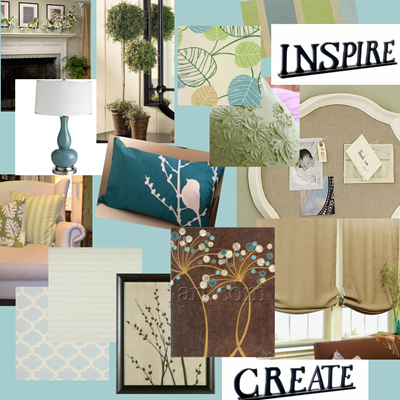
Well, those lighter colors will carry over to the den side of the room and hopefully make the whole space look more cohesive.  Here’s a look at some of my inspiration for the new den design:

inspiration board

So, there’s my jumping off point, now I better get to work! :)

signature

Wednesday, August 26, 2009

Sneak Peek: Couch Recovery

Lately, Mama and I have been working on re-upholstering an old couch for my den.  It should be finished for a reveal this weekend, but to tide us over until then…. here are a few before pictures:


IMG_9034 IMG_9033This beauty was a $5.50 find at Goodwill.  You know my mother cannot pass up any salvageable item for five bucks!  This couch has seen better days… it was obviously a well-loved scratching posts for some naughty kitties (sound familiar, Bandit?!).  But, we are in the process of restoring it to its former glory (and then some!)

Here’s a look at the process:

IMG_9038

IMG_9041

IMG_9044 

The first step in the upholstery process was to pry up about 50,000 staples and tear off all the old fabric and the underlayer of cotton to prepare the piece for refinishing.  Mama then stained the legs and we got to work on the “recovery”. 

We have two wingchairs to go with the couch so we went to Mary Jo’s in Gastonia to look for fabric to cover the three pieces.  This was our second trip, mind you… after the first trip we came home with nothing for the furniture!  After another long and arduous search, which involved lugging/dragging huge bolts of fabric around the store to match patterns and colors, I finally decided on two patterns (one for couch, one for both of the chairs).  Here they are:

001-horizon-5895.jpg

and

city blocks

Since we bought 10 yards of each, when we got home we had a decision to make… a blue couch or a cream couch?

Here’s a look at the options with some of the other fabrics we picked up to coordinate:

IMG_9047   IMG_9048 

Well, the couch is well underway… but the color will remain a surprise until the big reveal… which fabric do you think we picked? :)

signature

Friday, August 21, 2009

Fantastic Foyer

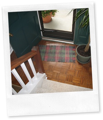
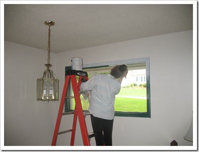
IMG_7042 Well, that’s not a fantastic foyer… that’s just a ho-hum foyer.  That’s because this foyer is the befoyer (before foyer).  As in, before we moved in.

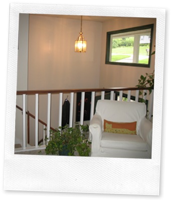
Our house is a split foyer; as you enter through the front door, you are greeted by a split staircase, half going up, the other half down.  And here, in the befoyer, you were also greeted by a tree.  Who doesn’t want to smack into a tree every time they open the front door?

Anyway, I digress.  Somewhere in the evolution of this house, someone came along that was enamored with hunter green (before that it was blue).  All the trim in the upper level was hunter green!  The door was hunter green and the shutters are hunter green.  The stair railings were too!  I would like to thank the realtor that said to these homeowners, “Paint the trim white.”  My arms also thank them.

Paint, they did.  Much to my dismay, they left the lovely shade of green on the front door and all the trim in the befoyer. 

There is a picture window above the front door which we love because it lets in lots of light.  What is not so great about this window is that it is 12 feet off the floor!!  Perhaps that is why they did not paint it? 

Before:

IMG_7029 Oh, and did I mention that not only was the door and trim green, but also distressed!  Like, sanded to look crappy… yeah… that.  (I can take a little distressing, as is evident in my work jeans and the back of the couch where Bandit sharpens his claws implements of human torture. hehe) 

After living with the green door for a while, I realized that a couple coats of paint could snazzy up the entrance of our house.   After priming with Kilz and slapping on two coats of white semi-gloss, I thought I was done.  A third coat is really needed to cover that dark green, but alas, I haven’t got around to that yet. :)  All the trim in the house needs a third (or second?) coat.  I’m sure we’ll get to that as we paint each of the rooms in turn.  So far:

Laundry Room … check

Foyer … check

Hmmm… progress is progress right? ;)

Here we go on beautifying the befoyer:

IMG_8472

IMG_8468 

IMG_8544 

That’s my Mama on the big ladder doing the window trim. (Thank goodness for handy parents with giant ladders that miraculously still fit into the foyer when unfolded.)

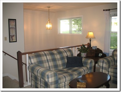
And now for the big reveal:

IMG_8957

IMG_8959

IMG_8954 

Ahh, so refreshing… and easy on the eyes!  I love the new clean look… how bout you?

signature

Tuesday, August 18, 2009

I’m a fan

Ceiling fans are great, especially in a kitchen, when you are doing a lot of cookin’ and it gets really hot and you just need AIR!  And sometimes you char your broiler chars a steak and there is smoke everywhere.  They are handy then, too.

When we bought this house there was a cheap-o little white fan that served our purposes well… it could move air:

IMG_8543

However, it was just not pretty enough.  So, of course, I had to remedy that. 

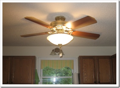
My former boss generously gave us a Hunter ceiling fan for our new house… yay!  Thanks, Lisa!  So, after we decided that it matched the kitchen cabinets quite nicely, we just had to purchase a light kit to coordinate.

I selected the Hunter Energy Efficient Scavo Bowl Light (whatever that means).  :)  Guess why… it was pretty!  I also liked that it included a fancy circular fluorescent light bulb.

Anyway, so we had my father install that sucker.  And since we don’t always measure things… or read the directions, after he put it up with the little extender pivot thing, we had to take it down and re-hang it flush so as not to decapitate poor Michael and other tall guests. :) 

Ah, much better:

IMG_9012

It really classes up the joint.   I’m a fan.

signature

Postscript: No ceiling fans were harmed in this process.  The little white fan was adopted and found a new home in my father’s workshop, where it will not be judged for its homeliness. 

The Kitchen: In the Limelight

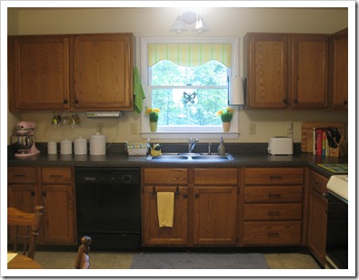
Lately, I have been wasting a lot of time photoshopping my kitchen photos.

We’ve had the same lemon/lime/blue thing going on in our kitchen since our first kitchen back at the old apartment:

05 Sept - Apt kitchen

Even before that, we had a little yellow going on in our college apartment:

kitchen

I didn’t even like yellow, really, but my Mama bought me a yellow spice rack for Christmas and a pasta jar, so to make them match, I tied a yellow ribbon on the jar and a theme was born. And since then I have been collecting lemon yellow and lime green kitchen crap accessories. (With a short hiatus due to my obsession with pink which has resulted in an accumulation of bowls, pans, spatulas, measuring cups, and a KitchenAid mixer in that lovely and oh-s0-gender-neutral shade. Michael just loves it.)

Anyway, once I decided what color the kitchen in our apartment would be, I went fabric shopping (yeah!) and found a peppy yellow and green stripe fabric. I bought it all :) hehe and made cafe curtains and a tablecloth.

The cafe curtains were great to infuse our dreary apartment with some life and also to give us some privacy from our neighbors across the way:

IMG_3168

When we moved to our new house, I just stuck the curtains in the window as they were (they matched all the amassed accessories, after all!):

IMG_7389

But, after I cleared out the decor from our kitchen for a base photo on which to inflict my digital pasting of accessories and paint colors (I now know what my mother was talking about when as a child she would cut out pictures from the Sears catalog and arrange them to decorate her future house. hehe) I realized that those cafe curtains were sucking up the light!

And since our kitchen faces the backyard and woods, we didn’t need curtains to block prying eyes.

So, after trolling the internet for ideas, here is my photo-shopped inspiration. A nice little scalloped valance with festive black trim! (in addition to quite an array of other accessories I pasted on our blah kitchen… don’t you love the “eat dessert first sign”? I had to put that up there because someone is very adamant against having junk on top of the cabinets… hehe):

kitchen with glass front access small

Of course, I didn’t have any green print or ball fringe, so I had to compromise. Here is our newly redesigned kitchen window:

IMG_9011

IMG_9025

And since I still had a lot of yellow stripe fabric left over, I made myself some placemats to match! hehe

IMG_9032

Now, if I can just convince someone to let me paint the kitchen table black. And the oven… and the fridge……

Monday, August 17, 2009

Dining Room Design

I have been tweaking the design of our formal dining room this past weekend after the addition of a new mirror that my father built for us. Our dining room features french doors leading out to the upper deck, as well as a doorway to the living room and one to the kitchen. So that doesn't leave a lot of walls for furniture like a china cabinet. We have a big dining table (handmade by Michael's grandfather and uncle and passed down to us as a wedding gift), and a set of eight dining chairs in a cherry finish that we purchased last Christmas.

Here is our first dining room back in the fall when we moved in (with chairs snagged from kitchen and curtains half finished):


Then we got our new chairs and the dining room design began to take shape:


And since then I have changed the mirror, art, and accessories twice more. Here's a look at the cherry blossom art that I painted but never fell in love with:


So, I swiped a couple canvases from the den, and added a set of vintage peacock plates:


These plates were a gift from a family friend. I think they go well in here:


When the new mirror was completed (Papa built it and Mama stained it beautifully), we placed it on the opposite wall:


Mama also refinished the candle sconces next to the french doors and I added hurricanes to glam it up a little, plus a little shelf with a few "dining" themed accessories:


The next project in this room is a wall mounted corner cabinet that will hang in the only free corner left (haha!) Papa is in the process of building it now. When completed, it will dress up the corner across from the plates on the wall next to the living room. I plan to display my crystal glasses there, which will free up some kitchen cabinet space! :) Can't wait!

So, the dining room is finished (for now). In the future, we would like to get a chandelier to replace the ceiling fan and I would love to have wainscoting and a chair rail around the room! Some new paint would be good, too; this room gets a lot of light and I love it bright, so I'm not sure what shade to use. I also think the mirror wall needs something else... but I can't decide what... what do you think?