Sunday, November 20, 2011
Office Desk Design
Enter Google SketchUp. After a tenuous “getting-to-know-you” period, SketchUp and I have become fast friends. Don’t ask me to draw any spindley legs or spheres, but I think I have a handle on the simple operations required to draw a desk. I’ll let you be the judge. :)
Here is the latest (and hopefully final) version of the Horvaths’ Dream Desk:
I call it the airplane desk, because of those 5’ wings on each side, it looks like it’s about to lift off.
It is no easy task to design a desk for two people in a 10x10 room with a window, a closet and a door. It should be. But these are the Horvaths we’re talking about here. Nothing is ever easy with those two. :)
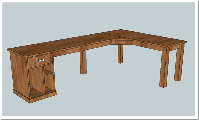
Our original plan was to build an L-shaped corner desk facing the window so we could both enjoy the view. The desk was nearly nine feet wide and two feet deep. The corner would allow Michael ample desk space for his elbows and giant monitor, and I would have a little cabinet with a drawer:
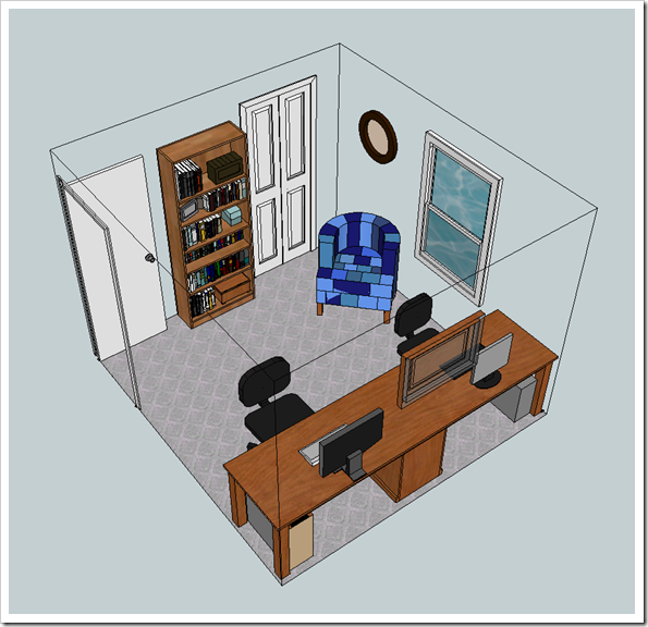
Here’s the room in SketchUp with the furniture and walls and doors:
I rearranged our existing furniture in the room to simulate the L-shaped desk (minus the corner):
That didn’t leave us much breathing room with the chairs so close together and the closet door to the left. (The closet door is getting replaced with bifold doors in all of these designs. That will allow us to put furniture a bit closer to the closet and still be able to open the door.) The desk area of the room was cluttered and there wasn’t a lot of space for us to spread out without bumping into each other. Even though it was crowded, we loved being able to see out the window. We tried this arrangement with the dimensions taped out on the floor. It seemed like it would work; I was about ready to post it to the blog, thereby making it official, when we decided to try another arrangement.
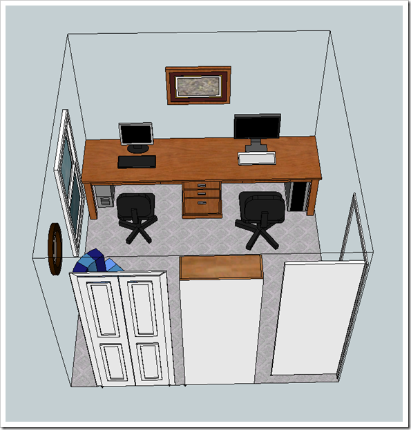
So, I designed Desk #2 on the 10-foot wall across from the bookcase. Enter airplane desk… it’s 10 feet wide and 30 inches deep. That’s twenty five square feet of desk space on top for us to spread out and set up laptops and additional monitors. A programmer’s heart’s desire.
In addition to a giant tabletop, it’s also got a few storage secrets. The three drawers in the middle will be perfect for office supplies and files. And in the middle of each workspace there is a hidden drawer where we can stash more office papers and junk. See it up under the front edge?
Here’s the second design in SketchUp with the furniture and walls and doors:
Then I rearranged the room to simulate the new design:
I love it! I’m keeping my fingers crossed that this is the best and final version of the desk. Now to get the programmer’s seal of approval so I can start that shopping list!
Wednesday, November 16, 2011
Pumpkin Topiaries and a New Doormat!
Well since Thanksgiving is next week, I figured it was past time for me to share my autumn porch decor!
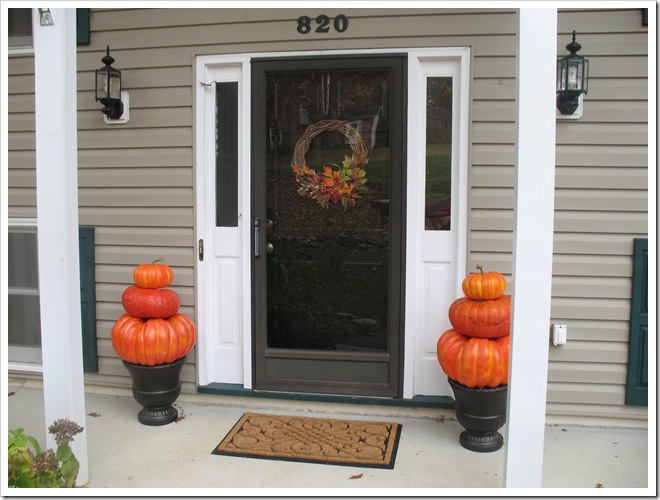
This year I skipped the mums (save one that I planted by the mailbox) and went straight for the pumpkins! After our Halloween party I snatched the towering pumpkin topiaries to use on my front porch. But rather than sitting them on the ground, I put them atop my spray painted urns for a little extra height. I think next year I will weave leaf garland around each tier and maybe add some string lights? That could be pretty!
I added my old fall grapevine wreath to the front door. I am loving how everything pops against the new black door!
And while I was at it, I added a new jute doormat from Lowes.
Back when I shared my black door transformation, there was some concern over my less than stellar doormat, which I had already attempted to repaint. I could tell it was not hitting the spot. And even Michael suggested I get a new one. Then he said that it needed to be bigger.
Lightbulb! YES! The porch is so long and skinny and the doorframe + sidelights so wide that a regular size welcome mat looked dinky in comparison. So off I went (birthday gift card in hand—Thanks Mike and Molly!) to Lowes to pick out a new, larger doormat. Luckily they had this oversized beauty. I love it! I think it completes the porch perfectly.
It’s looking better, but I still have a long way to go… paint storm door, threshold and shutters. (I did get the porch washed though… Thanks Papa!) The painting projects will be on hold until warmer weather.
But the porch is sure to get a lot of attention soon, in the form of Christmas decorations! Yay!
Tuesday, November 15, 2011
Kitchen Clean Sweep
I came home from Christmas shopping on Sunday to find my kitchen counters had been rearranged. Elves? No, it was Michael. In an attempt to find more prep space in the kitchen, he moved the microwave, toaster, canisters and kitchen tools. At first I was resistant to the new layout, but after living with it a few days, it is starting to grow on me. :)
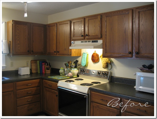
Here’s what I’m talking about:
The corner on the left is where we usually do most of our prep work for meals. The cutting boards are stowed beside the cookbooks and the knives are in the corner. Sink to the left makes the perfect work spot. This area stayed mostly the same, except the glass cutting board (which has been deemed useless, decor-only by you-know-who) was moved to the opposite side of the stove, along with the oil and salt and pepper tray. That opened up the space to the left of the stove for more prep space.
The toaster was also relocated, which gave us more room beside the sink, and also made it easier to access the cutting boards. It went to live where the microwave used to be, next to the refrigerator. This area was always cluttered by the bulky microwave. Getting rid of that has made a big difference in prep space and convenience when taking things out/putting things in the fridge.
The microwave moved all the way across the room next to the dishwasher. Granted it’s a bit outside the “work triangle” that we had before, but we don’t use it all the time, so it works better for us to have the empty space near the stove. Putting in on the far counter meant the pink KitchenAid mixer had to find a new home. It found a spot in the pantry. :( I guess it will be okay, though, since I don’t use it that often. (I secretly think the whole “rearrange the kitchen” scheme was just so Michael could hide my pink mixer!)
We managed to gain a lot more usable prep space which hopefully will make working together in the kitchen more enjoyable and efficient. And having all the counters cleared off is an incentive to keep things clean and clutter-free! Which reminds me, I should probably go do the dishes…
Thanks for reading!
I’ll be back soon to reveal our autumn porch decor, as well as a special project I’m working on for the office!
Thursday, November 03, 2011
Halloween Party Wrap-Up
Ahhh, Halloween is over. I am bummed but also a bit relieved since so much time and energy was required to host our 15th Annual Halloween Costume Party. Now that it’s all behind us, let’s reflect on our evening of mischief!
Guests were led up a lighted path to the front porch…
Which was wrapped with garbage bag garland and lighted with orange lights.
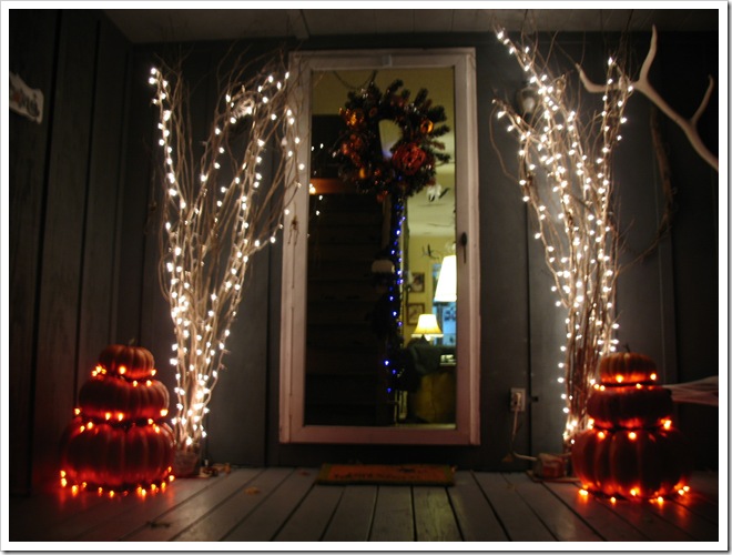
A couple of spooky glowing trees flanked the front door along with the pumpkin topiaries.
Visitors were discouraged from lingering by the giant spider and his well-wrapped prey.
(I have been wanting one of those cocoon mummy things for a couple of years. This year, rather than buying a cheap wire version, I decided to make my own. Using plastic grocery bags and tissue paper, I taped together a man-sized form and wrapped him up with sheeting and cheesecloth.)
The party got underway in the living room. The mantel was the focal point with the dinner buffet spread out in front.
Dinner included mini stuffed potatoes, mummy dogs, chicken strips, a veggie tray, bruschetta, shrimp cocktail, pizza, chips ‘n’ dip, and a cheesy witch’s hat! Not to mention there was an entire taco salad bar in the next room and a buffet of desserts!
More spooky trees added to the ambiance in front of the bookcase.
And on the far wall, Dracula set out with his candelabra for a walk through the graveyard, while ghosts and bats danced in the sky.
(For this transformation, we simply painted the graveyard silhouette on the wall. Dracula was cut out of foam core and taped up alongside. It was definitely a hit with our party guests!)
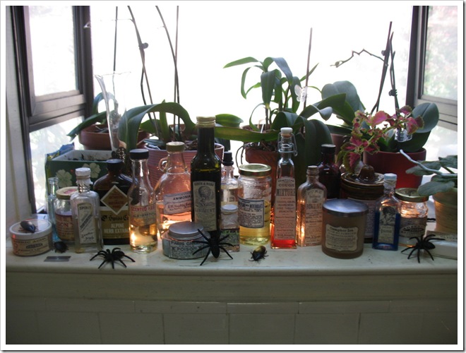
The kitchen got a little Halloween-ification, as well, with a ton of tinsel and a very special apothecary collection in the window.
Various tonics, potions and poisons are laid out, close at hand.
(We collected various bottles, some vintage, some new, and glued on apothecary labels that I found online. I filled a few with colored water, and some with various crystalline substances and powders to give it an authentic look.)
The dining room was for punch, the taco bar, and desserts. The silhouettes returned to grace the main wall and ghosts fluttered from the ceiling.
Dessert included Halloween shaped cookies and chocolate cupcakes with orange, green and gray frosting.
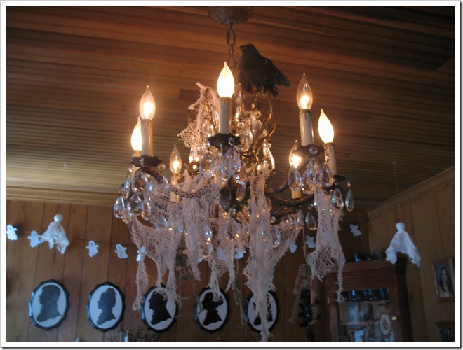
The chandelier was draped with creepy cloth, skeleton figures and a lone raven perched on top.
The parlor, or billiards hall, was decorated with new gothic cornices on the windows.
And ivy and bats in the corner.
Costumes ranged from historical to cartoon, with a few Halloween favorites thrown in. We abandoned our popular vote costume contest a few years ago, but this year I decided to award superlatives to several notable costumes.
Best Dressed: Josh and Hannah as Doc Holiday and Big-Nose Kate
Most Creative: Debbie as a paper doll
Best Historical Figure: John as William Wallace (Braveheart)
Crowd Favorite: Abby as a tiny witch
Best Use of Props: Nelson as “The Jerk”
Most Groovy: Mike and Molly as a pair of hippies
Though I didn’t win anything, I really enjoyed my pirate costume, mostly because I got to carry a sword.
Here’s me and Michael, dueling: Sword versus Spell.
After sampling all the delicious offerings for dinner and playing a few rounds of pool, guests retired to the graveyard to enjoy the cozy firepit, ghost stories and S’mores!
And at the end of the evening, we even got a couple of songs out of Johnny Cash.
Hope you all had a Happy Halloween!!