Monday, October 28, 2013

More Haunted Halloween Spaces!

Only 3 more days till Halloween!!!  And only five days until the most fabulous, spooky Halloween party of all time! :)  Forgive me for my absence, will you?  I’ve been busy decorating and menu planning and costume prepping.  But I would be remiss if I let this week slip by without a few more sneak peeks before the big soiree this weekend.  So here you are:

IMG_4853

IMG_4820

IMG_4827

IMG_4817

IMG_4835

IMG_4846

Can’t wait, can’t wait!!  Hope you all have spooky Halloween plans, too! :)

signature pink

If you missed last week’s sneak peek, check it out here.  And for all things Halloween, go here! :)

Sunday, October 20, 2013

Halloween Sneak Peek

October is almost over which means we are in Halloween decorating mode for our annual costume party.  The party falls on the weekend after Halloween so you’ll have to wait for the full reveal.  But I thought I’d share a quick peek at some of our new decorations this year.

Every year we say we aren’t going to buy anything else.  And then we carry all the boxes of stuff down from the attic and I become adamant about not buying new decorations.  We have over 20 boxes of decorations, people, it’s insane!  But inevitably we see something on sale that we “just have to have” and there goes my resolve!  So this year we have only bought a few new things so far (clearance sales after Halloween are our favorite time to shop, though, so it could get worse!)

Among our purchases is a faux mercury glass skull from Big Lots.  It looks just like the Pottery Bern version but it was only $5 and it is gorgeous!  :)  So I had to feature it in my special display:  The Cabinet of Curiosities.

This china corner cabinet was a recent find of my mother’s.  It is isn’t completely refinished yet, but she recently acquired new glass shelves for it, so it was empty and just waiting for my designer touch to spookify it!  I am so excited, it is my favorite Halloween vignette ever!

IMG_4798

It is in the corner of the “vampire parlor,” as we are calling it.  It’s packed full of silver, black and white accents.  There’s even a light in the top so everything is illuminated for the party!  Love it!

IMG_4802

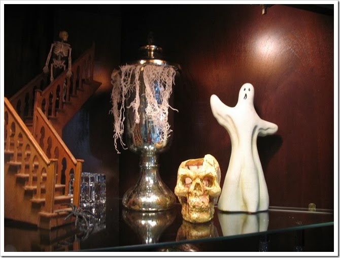
Welcome to the cabinet of curiosities!  On the top shelf we have the “staircase to nowhere” which actually leads to the second floor of a dollhouse that we started constructing 20 years ago.  There’s a little skeleton waiting on the stairs. :)

IMG_4804

IMG_4805

The next shelf has a stack of old books topped by the famous mercury glass skull.  It really sparkles with the lighting in here.  The bony hand is from a bag of bones that we usually dump in the graveyard, but I have repurposed some of them for inside use this year. 

IMG_4811

The bottom shelf features my PB mercury glass pumpkin and the faux mercury glass frame that I painted as well as an arm that I wired together and some crystal bottles. 

IMG_4809

The glass doors show a section of what’s inside, but you’ll have to draw nearer to see the details. :)

IMG_4796

Pretty curious, yes?

IMG_4812

Only 10 days till Halloween (and 12 until our party!)  Are you ready to get spooked?

signature pink

Friday, October 04, 2013

I see [some shutters] and I want [them] painted black!

So… two years and two months ago I had this brilliant idea to paint the front door black.  At the end of the post I told you how I was going to paint the storm door and the shutters to match.  Yeah, well… about that…  I am slow. 

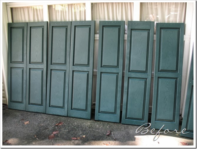
I have finally completed phase two of “paint all the things black”.  My dad came a few weeks ago and took down all the shutters for me.  I don’t do tall ladders. :) 

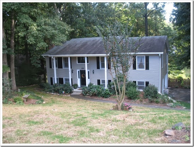
We powerwashed them and stood them up by the driveway.  Then they sat there for a couple weeks.  And in the meantime my house looked like this:

IMG_3971

Finally I got around to washing them again and painting them black!

IMG_4515

IMG_4514

So while we were taking down the shutters these little pieces of paper kept fluttering down.  They read:  “Due to the ‘color molded-in process’ these shutters cannot be painted” or somesuch nonsense.

Uh, yeah right.  We decided that maybe in 1990 or whenever these were installed, they couldn’t be painted.  But the paint world has evolved and now we have this nifty thing called Krylon Fusion!  So I disregarded the stupid little notices and followed the directions on the paint can for painting vinyl.

I basically sprayed on two coats and let them dry before moving them into the garage to cure for a week. While I was at it, I stuck all the screws in a piece of cardboard and painted the heads.

Then Papa returned and we reinstalled all the shutters.  FYI shutters have a right side up.  We hung the first one upside down because I wasn’t paying attention.  Duh!  When we finished, I stood back to admire the new look.  And I love it!

IMG_4765

(No, our grass did not die… we are reseeding the front yard!)

IMG_4766

I love it, I love it!  It feels like it was this way all along, probably because the old color was hunter green which is pretty dark, so you might not notice.  Lucky for you, I am telling you! 

IMG_4767

IMG_4771

Now I just hope this paint will hold up for a while.  If not, I suppose I can always repaint them! :)  And of course I must do something about the storm door.

I almost forgot the best part:  Before and After!!

IMG_0007

IMG_4767

signature 1

Wednesday, October 02, 2013

Bakery Sign & a Pink Fall Tablescape

I’ve been waiting to share a new addition to our kitchen.  Last week was my birthday and my best friend gave me a pink glass cake stand.  It was the perfect complement to my new “bakery” sign, so I figured the time was right to blog about them both! 

IMG_4751

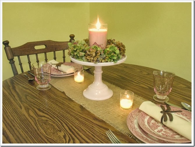
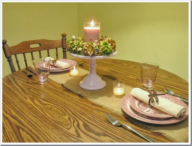
To match the rustic sign and the fall season, I set the table in a rustic pink, green, and brown fall theme.

IMG_4752

The cake stand was the centerpiece topped with dried green and brown hydrangeas.  I nestled my favorite pink candle in the middle.  Then I set the table with a burlap runner and my pink willow plates and pink glassware.  I finished off the setting with a cream napkin and a couple of bronze dragonfly napkin rings.  I think its says “rustic romance with touches of autumn.”  :)  That sounds like a perfume or something! haha! It was fun to pull out all my pink dining accessories that never see the light of day.  Michael has been bugging me to get rid of the glasses, but they were a wedding present and they are beautiful!
IMG_4753

My vision was to have the cake stand filled with pretty pink cupcakes, since that definitely goes with the bakery sign!  But I still have birthday cake leftovers and definitely don’t need cupcakes, so maybe next time I’ll feature those! :)

IMG_4757

This cake stand is so gorgeous, I plan to use it for more tablescapes in the Spring, and for some cake at some point, too!!  Thanks, Andi and Nick!

IMG_4759

IMG_4760

The bakery sign was a compromise I made with Michael.  I wanted to do a sign like this from The Old Painted Cottage.  Considering it was going to cost over $50 to have the wooden letters cut and Michael thought it was ostentatious, I decided to make this small version instead.  (Although, I still love the big lettering best!)

IMG_4764

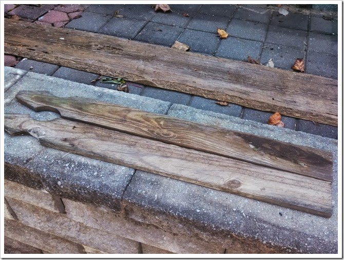
So, last month while I was visiting my parents I asked Papa to make me a “cool, old sign” that I could paint.  As we were rummaging around looking for old wood to use we came across a great pile of fence slats that were from our old fence when we tore it down.  So I gathered up a few of these and we set to cutting out a sign.
IMG_20130826_115112_339

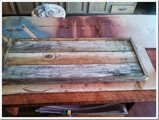
My sign is the maximum length of the fence slats with the tops cut off and three fence slats wide. 

IMG_20130826_115126_003

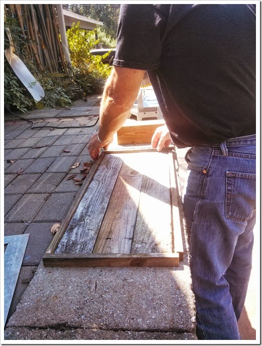
Papa thought it would be neat to add little edger pieces to make a frame.  We cut them from the same wood but slightly wider than the sign depth so they would stick up from the edge like a real frame. 
IMG_20130826_120526_432

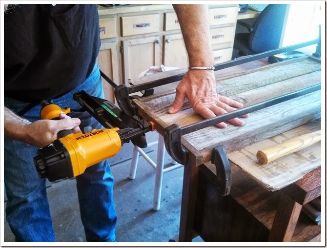
Papa nailed and glued it all together.  But it was really hard to glue the old wood since it was warped and stuff, so just ignore that part. :)
IMG_20130826_122427_197

Ta-da!  All done.

IMG_20130826_122920_215

I brought it home with me and printed a template for the wording.  The font is Chalk Hand Lettering Shaded.

IMG_20130826_194636_718

I transferred it to the sign with chalk and then filled it in with white paint and a small brush.

IMG_20130826_200026_962

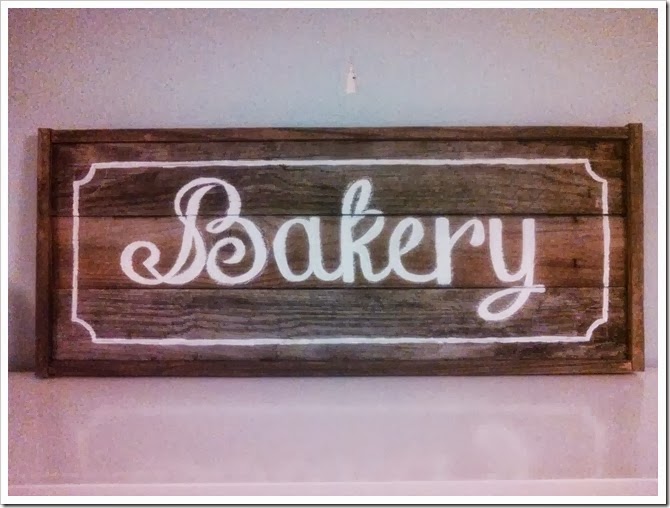
Then I added a little border outside the lettering.  See how cute?  (Forgive the fuzzy phone pics—that is the only way I ever take progress photos.)
IMG_20130826_202818_783

Now, if I were a normal person I would have stopped right there with my lovely rustic sign (maybe I would have distressed it a bit).  But I am not normal, so I went right along with my harebrained plan to stain over the paint.  I used Bombay Mahogany which has purple/red undertones.  So naturally the white paint turned pink.  Yay.  Not.

IMG_20130826_213304_789

So, the next day I repainted the letters with oil paint over the stain so it wouldn’t bleed through.  So far this is working, none of the pink stain has bled through again.  Next time I will just stain it first. :)

After my second painting dried, I went back with a hammer and a scraper and beat the crap out of my sign… gouging it and whacking it and making it look “cool and old” with some of the original wood showing through.  I think it turned out awesome!  I love my new bakery sign.

IMG_4764

IMG_4751

What do you think?

signature 1