Wednesday, June 30, 2010

Vanity Fair

After many hours of sanding, staining, cursing, and aching… the guest bath vanity is finished!  No more worn, dated cabinets of unknown orangey color and “antiqued” brass knobs.   It may be the same old cabinet from 1984, but this beauty has a new lease on life!

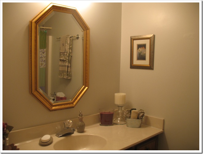
Here’s another look from before:

IMG_1471

And here is my photoshopped inspiration photo:

cabinets stained nickel knobs

And now, the big reveal:

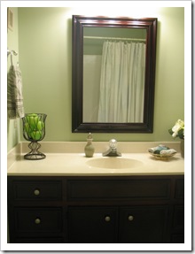
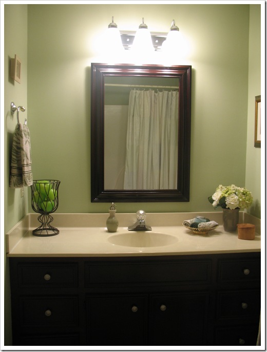
IMG_2481

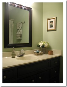
From inspiration to reality was as easy as a few days work, a can of stain, a $25 mirror and $17 in new hardware…  I used a one-inch artist’s brush (that seems crazy, but it worked for me and gave me better control than with a big paint brush) on the first four coats followed by one topcoat applied with a foam sponge brush.  I am in love with the results…

IMG_2466IMG_2474IMG_2489 

I snagged the satin nickel knobs on Ebay for less than half the cost of Lowe’s.   And I simply spray painted the old hinges with oil rubbed bronze and reused them instead of buying nickel ones.  They blend in so well, you can hardly see them. :)

IMG_2467

The new mirror looks right at home now with the matching cabinets.  Our guest bathroom is so beautiful after the transformation!  Soon, I will forget how it used to look and the overwhelming feeling of accomplishment and pride will go away… we can’t let that happen, so here’s a side by side comparison of the before and after composite photos for your (and my) viewing pleasure.  :)

bathroom collage     guest bath composite

(Please forgive the bad splice job; I just can’t seem to figure that out!)

So, what do you think?  Are you ready to give it a try on your old vanity or some other piece of furniture that needs a face-lift?  You can bet this will get the ball rolling around here.  I have plans to do the master bathroom cabinets and our office bookcase in the future. 

That brings us to the end of this fair vanity makeover.  Still to come in the guest bath project are a new shower curtain and artwork.  Keep it here for all the latest!

signature

P.S. Before you ask… those are green apple candles in the iron urn (Thanks Debbie and Nichole!).  Don’t know why you would want an apple (or a bunch of them) in the bathroom… but they are green, so there you go.  Don’t ask me…. I can’t explain my motivations. :) 

Tuesday, June 29, 2010

Guest Bath Progress

Hello!  I am back with the latest updates from our guest bathroom makeover.  I told you last time that we got a new mirror and light fixture to replace the funky brass ones that were left by the previous homeowners. 

I like to pretend that they took all their nice, updated fixtures with them when they moved, rather than believe that they always lived with these ugly ones! Of course, I do realize that not everyone has “pretty mirror” at the top of their priorities. ;)

Anyway, I digress… onwards with the update!  Remember my new light fixture (the wall color in this photo is way off, but at least you can see the light… hehe):

IMG_2435

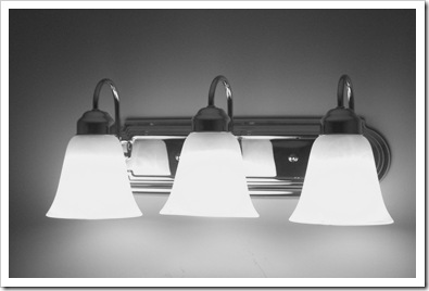
I installed this chrome beauty ALL BY MYSELF!  And I read the directions!  I know, it’s shocking. Not literally shocking, I was very careful and cut the breaker.  :)  I also wanted to show you what I found when I uninstalled the old light… wallpaper (and it’s hunter green… surprise, surprise)!  Isn’t it nice that they saved me a little relic under there?  I left it for the next person to find when they go to update my “horrible chrome light from the twenty-tens”.  hehe.  Maybe they’ll think I liked hunter green wallpaper with little dots, too. 

IMG_2403

Now that we have color on the walls and a beautiful new light, we can get to the real star of the room… the vanity.  Remember, back in February when I asked you “to paint or not to paint?” regarding the vanity cabinets.  Well, two thirds of you (thanks to my three enthusiastic voters) voted for stained mahogany cabinets with nickel knobs.  That was my favorite option, too.  While the off-white painted version surely would have made the room look bigger… I opted to go with a more elegant, classic look.  One that complements the rest of our house, as well.  And one that has nearly broken my back with effort.  You know what they say: “Good things come to those who break their backs”… I mean, “Beauty is pain.” :)

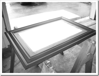
So, to begin with, I took an antique oak mirror and stripped the bad paint job.  Then we applied four coats of Bombay Mahogany polyshade (stain plus poly), followed by a protective polyurethane layer to seal the deal. 

We took it from this grunginess:

IMG_2243

To this beauty:

IMG_2459

For the bargain price of $25 plus the cost of stain, I think it’s a pretty good deal for a thick, durable (read: heavy!) mirror with a solid wood frame.  And doesn’t it looks snazzy on the new green walls?  I’m in love!  I would have liked to hang it horizontally like in my inspiration photo:

cabinets stained nickel knobs

But, my steal of a deal mirror was a bit too small to accommodate both me (short) and Michael (tall).  That’s the reality of living with tall husbands (right, Andi?).  I don’t think Michael would appreciate having his head cut off in the mirror. :)  Ultimately, I think it looks nice hanging vertically, and gives me a better view of my outfit, too! :)

Here is the unremarkable mirror before, with unremarkable cream walls:

IMG_8999

And here is the fresh, elegant after:

IMG_2460

LOVE.

Okay, that brings you up to date on the progress in here.  I’ll be back (hopefully soon) with the rest of the reveal—mahogany stained cabinets!  Yippee!  Plus hand painted art and a custom shower curtain (since apparently no one sells shower curtains lovely enough for my bathroom).  Stay tuned!

signature

Sunday, June 27, 2010

Guest Bath Sneak Peek

The last couple of weeks I’ve been busy on a little project.

And by little, I mean the room… not the tasks!

We have been redecorating our guest bathroom!   It’s a tiny 8’ x 5’ space with a tub and shower and full size vanity taking over the room.  The dated, worn cabinets and brass fixtures were begging for an overhaul.  This is the place:

IMG_9001     IMG_9004

Very memorable and inspired, no?

Don’t you just love that brassy gold mirror… with the ever popular elongated octagon shape?  Yeah, me too.  I’m over the moon. :)

So, to begin with, the mirror had to go… and the matching brass light fixture with fluted glass sconces.  Blech.  I’m not even going to qualify that with a photo.  Just use your imagination.

After finding the perfect wood framed mirror (manufactured in 1960… yay reusing antiques!) and refinishing it,

IMG_2241

and the perfect(ly priced) chrome light fixture (yay, Walmart!),

IMG_2435

then we were off to find the perfect (or thereabouts) paint color.  Our search finally ended with a lovely sage green called Bayou Shade by Valspar.

Here is your sneak peek!

IMG_2432

Ahh.. so refreshing. 

So, that’s all you’re getting for today, but I will be back with more updates on the guest bathroom makeover!  There is more to come including mirror and vanity refinishing, a new shower curtain and accessories, plus some homemade artwork!  Stay tuned!

signature

Saturday, June 26, 2010

June Blooms

We’re back in the garden to take a look at what’s blooming this month:

The hydrangeas have busted out and are looking more blue than they did in May.

IMG_2372

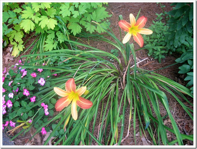
Lots of lovely daylilies.

IMG_2378  IMG_2414 IMG_2416

Pretty pink coneflowers… these are huge this year!

IMG_2418

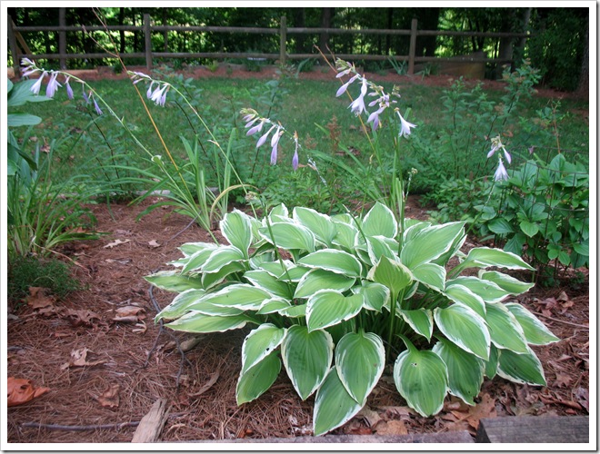
Hosta lilies are blooming!

IMG_2421

The purple butterfly bush is attracting some swallowtails.

IMG_2379

IMG_2424

Welcome Summer!

signature

Saturday, June 19, 2010

A Surprise Reveal! (in the dining room)

IMG_2392 

IMG_2393How do you like my new patriotic Independence Day centerpiece?  Just a splash of red, white and blue to get us into the spirit of the Fourth of July! 

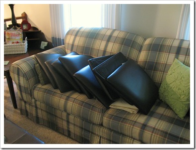
What’s that? You noticed something weird about that first picture?  Oh, there are no cushions on the seats?  Whoops!  hehe  That’s because I removed them and piled them on the couch. 


IMG_2390 Why would I do that do you ask?   Hmmm… that’s a good question.  Well it’s cuz I had to take them to the upholstery shop to be recovered.

Just kidding… as if!  My Mama and I recovered them with fun new fabric today!  SURPRISE!  I was ready for something a little lighter than black leather.  Plus, Bandit had done in a couple of the cushions with his devil claws.  We selected a textured chenille fabric in an ivory damask pattern that I hope will hide all future evil kitty scratch marks.  Plus it goes well with our cream curtains and trim.

Here’s the new fabric:

  IMG_2395   IMG_2396   

Now here’s a look at the BEFORE… black leather be gone!

IMG_1080

And AFTER, lovely and light:

IMG_2394

 What do you think?  You like the new look? 

Think it means that we need to paint the walls for more contrast?  Yeah, me too. :)

signature

P.S.  Don’t you love the new look of the blog?  I updated with some fancy new blogger features.  I love the tabs!  Thank you Illustrious Blogger People for hearing my pleas.  I promise to stop bad-mouthing you behind your back now. O:)

Edited to add:  Gah!  This post looks terrible in Reader!  Oh well! :)

Thursday, June 17, 2010

Guest Room Progress and a Poll

So, at long last, I have finally completed the linens in the guest room.  The pillow I showed you Bandit presented was just icing on the cake for the foundation pieces that are finally done. 

Here is the before:

IMG_2328

And After:

IMG_2383

Very subtle, right?  Just swapped out the bedskirt and pillows and added a teal throw.

IMG_2382

I finally replaced the bedsheet covering the boxspring with a proper bedskirt!  I bought the fabric many months ago and this week I decided to tackle the project.  At last, it’s done! Take a look at those awesome box pleated corners… you know, the ones that will never be seen because of the enormous duvet covering them?  Yeah those.

IMG_2386  IMG_2387

I also tossed on a couple of matching pillows.  The lovely ivory velvet ones we had in here before get to go back to the master bedroom where they will adorn the bed lay in a pile in the corner. :)  Here’s the crisp, new shams with their happy friend, Mr. Punchy pillow.  You’ve already met him.

IMG_2384  IMG_2385

So, that brings us to the end of the linens in the guest bedroom.  We can now update the checklist:

  • Paint
  • Bedding
  • Artwork
  • Seat cushion for cedar chest
  • Accent pillows
  • Bedskirt
  • Upholstered Headboard

That leaves us with one remaining project!  The Headboard!  We have the supplies and white fabric all ready to go, now anyone want to come decide on a style for me?  I just can’t choose between them!  Here are the contenders:

1. Square with curved corners

white headboard

2. Curved with square cutouts

betterhomesandgardensupholsteredheadboard_thumb

3. Lots of curly cutouts… Mama would hate me for this one!

elizabethdinkeldesigns_thumb

4. Simple curve

white curve headboard

5. Tall curve with big square corners, tufted

decorpadupholsteredupagainstwindow_thumb

6. Square, tufted

guest room 6

7. Curve, tufted

urban_tufted_headboard-718444

The sky is the limit for headboard shapes, but I’m cutting myself off at seven choices!  So, cast your vote… which is your favorite?

signature