Saturday, September 25, 2010

Heralding the Headboard

Finally!  A headboard for the guest room!

Yes, friends, the day has finally come.  After many months of searching, sketching and planning, the upholstered headboard is finally finished!  You remember way back when, I asked you to vote for your favorite headboard, because the decision was making me crazy?  Well, the votes were almost unanimous, everyone loved the first option!  Which was this lovely creation:

image

Unfortunately, I didn’t stop to consider the ease of creating any of the designs in my poll.  And once you guys voted, well, how could I deny you the headboard of your choosing for our guest room?  You are my pool of potential guests after all! :)  So, Mama and I set out to make this fuzzy online inspiration photo (from Pottery Barn) a reality in true Guthrie fashion.  <—Guthrie being the other half of this Horvath’s life.  :)

Our first step was determining the right dimensions to compliment our full size guest bed.  We had a scrap piece of plywood left over from another headboard project that was just the right size, 58” wide (for a little overlap on the mattress), and at 48” high, no modifications were needed.  I drew off the corner curves and cut them with a jigsaw—my first experience using the jigsaw and I have to admit it was quite fun and easy, too! 

IMG_2814  IMG_2816

Then we cut four support braces for the back so the plywood wouldn’t flex too much.  These were simple 1x4’s cut to length and screwed on.

IMG_2818

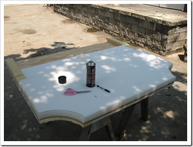
Now we were ready for cushioning!  We cut a piece of 2” foam exactly the size of our board and glued it on using spray adhesive.  Then we added strips of 1” foam cut to size and glued them down to the back edges (so the foam edge would wrap completely around the frame) and the sides so they would be perfectly smooth.  We cushioned all the way down to a few inches below where the mattress would hit the headboard so there wouldn’t be a visible line where the foam stopped.  We also added four inch strips on the edges (or “posts”) where the edges would show around the mattress.  That way the whole “post” of the headboard would be upholstered as well.  We later had to pry some of that foam off the posts to put in a 2x4 bracket piece that the bolts would fasten to.  Otherwise the whole headboard would have been held together through 2” of foam, a layer of batting and 1/2” plywood.  Not good.  A little extra wood added at the fastening point made for a lot more stability in the finished product.  We measured on the bed frame where the brackets would match up and put our wood piece in there.  Then I drilled holes through the 2x4 and plywood backer, so it would be all ready for bolts later.

IMG_2822

IMG_2826 IMG_2827 IMG_2829

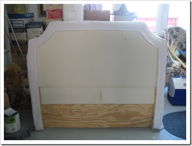
Here is the completely cushioned headboard ready for fabric!  Notice that we hadn’t added the 2x4 pieces on the posts yet.

IMG_2832

So, obviously, the third and final step was to cover the thing with fabric!  Artfully, of course.  Our design called for piping around a four-inch border.  First we planned the border pieces and the outer edge pieces.  They were piped and seamed together.  Then we measured for our center section and stitched it in. 

IMG_2863   IMG_2861

I’ll leave out the gory details, but this part was ridiculous!  A seemingly simple design turned into a frustrating ordeal.  Between the piping, the under layer of batting, shifty fabric (next time we are using real upholstery fabric that doesn’t have any stretch or give instead of soft chino), and the complexities of curves, angles, and corners, we were incredibly annoyed by the whole process.  I had long since given up on a successful completion but Mama would not be deterred.  After much fussing and re-cutting, she finally achieved the look we were going for.  And here it is in it’s new home:

IMG_2986

IMG_2988 IMG_2990   IMG_2991

Finito!

And just in time for our guests to arrive for Homecoming in a couple weeks.  I may have to try it out before they get here, it is so very soft and inviting.  The perfect place to kick back and read a good book.  With the window open and the glorious fall air rushing in.  Ahhhh…

Thanks for coming along on this guest room journey.  With the DIY light, upholstered headboard, and painting the closet off the list, I’m running out of things to do in here; guess I’ll just have to focus on another spot for a while. 

angel smiley

Come back soon for an update in the Den, as well as some fall decor! 

signature

Tuesday, September 14, 2010

The Great Console Table Hunt of 2010

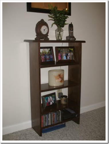
It’s two weeks to my birthday which means its about that time that I start thinking of all the wonderful things I want!  This year I decided number one on my list is a console table for our living room.  I told you about our living room furniture last August and how I desperately needed a console table to replace this poor piece of plywood:

image 

Now, I’m not knocking that fine craftsmanship, but it just wasn’t jiving with the rest of my furniture.  So began the Great Console Table Hunt of 2010!  I’ve been amassing inspiration pics from the internet for months, here are a few of the contenders:

image    console 2

I even designed one in Sketchup that I thought we could build:

console design

Our first leg of the hunt was the “20 Miles of Furniture” in Lenoir, NC.  We went on Labor Day, hoping to find good deals, but instead we found several stores were closed.. what is that about?  After perusing the selection at a dozen stores we discovered that most of the console tables available were huge!  I was limited in size by the small pass-through between the wall and the couch, so my table could be no more than 14” deep.  I think the furniture manufacturer’s must be making these things for massive homes with floor space to spare.  They were beautiful, if only I had a magic fairy wand to shrink them down to size!  All the accent tables that would have worked in my space were painted with roses or something and cost $400.  As if.  So, we moved on.  Others we liked but were the wrong shade… as you all know, it must be dark brown wood to belong in my house! :)  And some we found were just too small.  It was like Goldilocks and her three chairs/beds.  Except, nothing was just right….

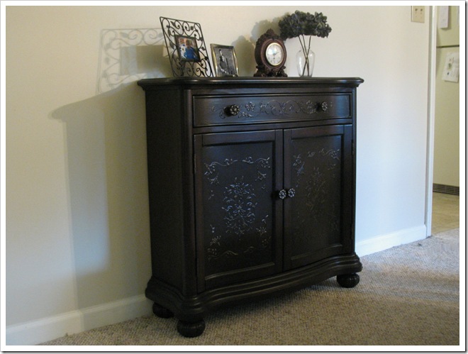
I had almost given up hope of finding something suitable in size without being predictable in design, when my mother suggested we try one more place… the Transit Damage Furniture Store down the road from her house.  Cue the trumpets!  It was like accent table Mecca!  They had a whole section of the store packed with long, skinny ones; short, fat ones; straight ones and curvy ones, ones with drawers and doors and spindles and glass fronts and all the colors of the accent table rainbow!  I finally decided on one with doors and a drawer, short but skinny, in a dark brown color with curves and a little floral embossing.  Perfection!  Not too plain, nor predictable, but not teal and painted with roses, either. :) 

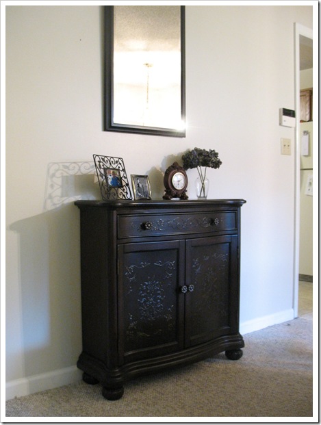
Just right for my house… I think.  You be the judge… here it is in its new home:

IMG_2954

IMG_2940

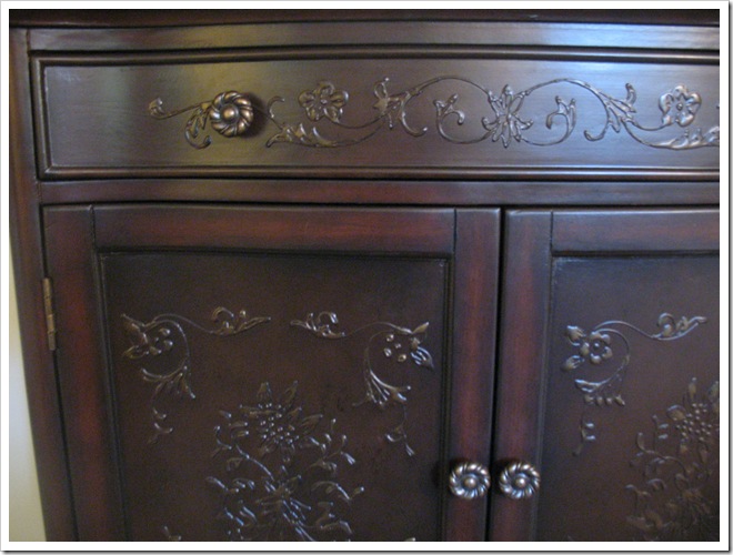
Here’s a little detail shot… I just love the embossing and the dainty floral knobs!

IMG_2943

And here is the whole view, with the mismatched mirror that’s hung too high.  Will get around to fixing that eventually, I suppose!

IMG_2950

For now, it’s making me smile, just the way it is! 

Thank you Mama for my beautiful birthday present (a little early).  :)

Now, if I could get the camel crickets in the basement to leave me alone, I’d bring up the fall decorations for a little spruce on top of the table.  :)  I’ll be back soon!

signature

Sunday, September 12, 2010

Sconce Spruce Up

I’ve been meaning to repaint/replace our front porch sconces for some time now.  They have been sporting a lovely worn brass finish with green cruddy accents.  Lovely, no?  Ummm, could that even be considered brass? 

IMG_8495

A few weeks ago I had my handy Papa take them down for me.  After surveying the condition, we determined that this was nothing a couple coats of spray paint couldn’t handle!  Papa took them home to his sandblaster and blasted the crud off of them for me.  That left them with a fresh and smooth finish, reading for painting.  It was so pretty that I almost left them that matte gold tone finish, but I finally decided just to paint them.  I chose satin black Rustoleum for a classic, all-weather finish.  After three good coats, they were ready to be reassembled and reinstalled.  Last week, we finally got them back up.  What a nice transformation.

IMG_2915    IMG_2914

I went ahead and spray painted the house numbers, too.  I wanted to get new ones that were less round-ish, but I figured, who really notices what your house numbers look like?  Stop being insane and paint the dang things! :)  So I did.  And they show up against the tan house color much better now.

IMG_2911

I also put spruced up my front door wreath for Fall!  It was feeling like Fall out this weekend!

Can’t wait… I’ll have more Autumn decorations to show you soon!

IMG_2913 

signature

Sunday, September 05, 2010

DIY Coffee Filter Light

What do you with 200 coffee filters, a paper lantern, and a glue gun.  Well aside from some sort of Project Runway challenge, you could make this awesome pom pom light! 

IMG_2903

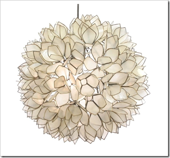
I first saw this idea from Kara Paslay Designs and was instantly intrigued.  It reminded me of this capiz lotus flower light that I found here:

image

Awesome, right… yeah but who has $300 to shell out for a trendy light fixture… Not me.  So, when Kara Paslay finally released her secret to this awesome light—coffee filters, I was eager to try my own version.  Luckily coffee filters are super cheap.  Throw in a little (okay a lot) hot glue, a small paper lantern, and a corded light kit = Success!  All for under $20 bucks!  Mine cost me only $2 for coffee filters since I already had hot glue, and a paper lantern leftover from my sister’s wedding.

I started with a 12” lantern and used all my 200 coffee filters with 1/3 of the lantern left to cover.  That’s when I realized that my lantern was going to be huge.  12” base + 3” fluffy filters on both sides was coming out way too big for the space.  So, I begrudgingly ripped all the filters off the first lantern (thus rendering it shredded… and garbage… casualty of DIY gone wrong.)  After procuring a second smaller lantern (this one about 9”) I reglued all the puffs.  200 was almost perfect!  I have a few spots that need another puff or two, but I figured it was good enough to try it out!

Here it is, in its new home… our newly decorated guest room!  And luckily I found a way to disguise most of the cord behind the curtain!  The only problem I haven’t overcome yet is how to turn it on more easily.  The cord has a little switch on it, but unfortunately that part ended up behind the bed… annoying but not impossible... maybe I should get one of these.  By day, it looks like a cool pom pom hanging from the ceiling.  Very fluffy and textural.

IMG_2899    IMG_2900

It gives off a soft glow during the day…

IMG_2904

And really lights up the room at night…

IMG_2893

I love it!  Makes me want to lay on the guest bed and stare at the pretty fluffy texture all night.  :) 

What do you think?  I figure if I get tired of it in here or “some people” deem it too trendy, tacky, or strange, it will make an awesome night light for our someday nursery. :)

Hope you all are enjoying this holiday weekend… I’ll be back with more updates in here as soon as our upholstered headboard is finished!

signature