Tuesday, August 30, 2011

I see a [front] door and I want it painted black…

First off, why is that song called “Paint it Black” instead of “Painted Black”??  Anyone?  I always thought the lyrics were “Paint it Black”…

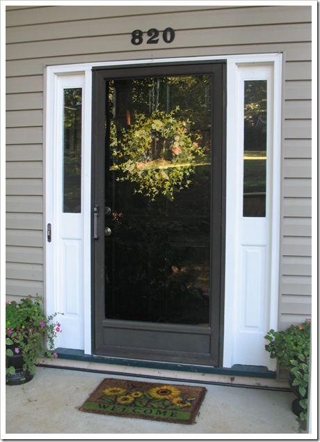
Anyway, last week I decided it was high time to paint our front door.  Since we moved in I have wanted to rid the exterior of the 90’s hunter green.  So naturally, I chose to go black, since I prefer it to blue, red, or white.  I would happily have painted the door spring green or yellow, but I figured black was something Michael and I could live with for a long time.  And I figured people would tease me if I painted it oil rubbed bronze! :) 

I picked up a quart of oil-based Rustoleum black in semi-gloss (which turned out to be quite shiny, but pleasantly so!).  I prepped the door by sanding trouble spots (drips, scratches, brush marks) with a rough paper (100 grit) and then finished it off by sanding the whole thing with a scouring pad, just to take the gloss down and give me something to adhere the paint to.  Then I wiped the it down with soap and water.  Next came the painting… I used a brush for the first coat and a roller for the second, but in hindsight, I should have rolled the first coat, too.  It took two coats to get the sheen even.  The first coat had a lot of shiny spots in it, but after the second coat it all seemed to be the same degree of shiny.  The hardest part was keeping the door open so it could air out and dry while preventing the cat and dog from escaping!  I set up a lovely barricade that involved a screen door, a fireplace screen, a chair and a piece of foamboard (to cover the top of the fireplace screen)… too bad I didn’t take a picture of that!  But I managed to keep the cat away from the wet paint and the open door to freedom. :)

Here is the result:

IMG_6917

I love it!  The black is so classy and elegant.  So long green door!!!

IMG_4654   IMG_6917

IMG_6920 IMG_6923

Now, as you can see, I still have a lot of work to do before the black door can really shine.  I have to paint the shutters black.  And repaint the white trim and threshold surrounding the door.  And I have to do something about that worn out faded black storm door.  This one:

IMG_6917

Blech storm door.

In my neighborhood wanderings I have noticed that some houses have storm doors that match the trim.  Some have gray or black ones, and some have other colors that seem to match nothing.  Since we won’t be doing that, I have narrowed it down to either white or black. 

Originally I was thinking the storm door should be black.  That way it would blend in with the front door and almost disappear.  But then after seeing all the white ones that matched the trim, I thought, “I have white trim… maybe that would look nice?”  And that is where you come in.  You must help me decide whether to paint the storm door white or black.  Here is a bit of photoshop magic (ahem… just pretend it looks like magic and not like I don’t know what I’m doing) to help with the decision:

black door

A. Black Door

white door

B. White Door

What do you think???  Do you like the black door or the white door better?

CAST YOUR VOTE NOW! 

Thanks for stopping by!

signature

Tuesday, August 23, 2011

Operation Paint the House: Going Gray

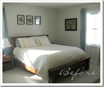
I finally got back to Operation Paint the House and tackled the master bedroom last weekend.  Since we moved in, I’ve been saying I wanted to paint this room either tan/cream or pale blue.   All the linens were pale blue, so it seemed like maybe the walls should be some other color.  Until I got a cream quilt.  And then I was back on the fence about blue versus cream.  Even a slew of paint samples couldn’t seem to make up my mind.  The contenders were all Olympic colors:

paint swatches

After analyzing and reanalyzing and then making Michael analyze, I finally gave up trying to find the “perfect” color and just picked the palest blue gray one.  Lunar eclipse was a second contender because it is the color of the master bath, but I thought it was a bit too dark in the bedroom.  I nixed all the cream and tan shades for being too blah.  I may end up using something similar in the hallway/foyer/living room where we really need a good neutral.  Once I had picked the color “going gray” (which seems to be a misnomer, because its definitely more blue than gray, maybe it’s blue going gray??) I went to Lowe’s to get it mixed.  I decided to do an eggshell finish, because I am fed up with trying to scrub flat paint (even though I love the look of it)…  And they convinced me to try the new Olympic One paint.  Silly me, I thought the “one” meant one coat, instead of paint and primer all-in-one.  Yes, I can read.  :)  Well I tried to do one coat, but my roller was not cooperating, and the pale color of the paint made it hard to see where I hadn’t yet painted.  Once it was dry, I realized I had a lot of touch up spots.  I should have just sucked it up and rolled on a second coat, but impatience struck!  My feet were tired from standing tippy toe on the ladder all day, and so I gave up and just touched up with a brush.  “Big mistake!  Huge! I have to go shopping now…”  <—name that movie…

Anyway, lesson learned.  You can’t touch up your first coat by going over the spots you missed.  I was left with little shiny spots in my finish everywhere I had touched up.  I think if I were using evil flat paint, that method would have worked.  At least that’s what I tell myself.  So, some day Sarah is going to have to repaint the bedroom.  But not today! :)

On to the results… Ta da!

IMG_6936

This color is just perfect for the bedroom, very serene and relaxing… and matches everything without being too much blue.  I love it!  For all you detail-oriented people out there, please note that I finally lengthened the curtains that I restyled back in oh… January.  :)  After adding a piece to lengthen them at the top, steaming them, and then stitching the pleats in place, now they look great!  Just don’t try to close them, Michael, because they are all tacked together to make them stay!  Yeah, I am that girl.  What’s that about form follows function??

IMG_6941

I wish our bed looked like this all the time!  It’s so inviting…

IMG_6944  IMG_6958

IMG_6959

IMG_6950

IMG_6948

IMG_6969

And here is a recent addition to the room: my mother’s jewelry box that she gave me. :)  It’s so pretty.

IMG_6974

Okay, I would say things are about done in here.  Maybe need some new artwork, and a new light fixture, of course.  But we’re almost there!  Here’s your side by side before and after comparison:

IMG_4309  IMG_6936

So, what do you think?  Want to come have a sleepover on my plushy bed?  We can stare at the new blue walls and sigh contentedly…

Thanks for stopping by… I’ll be back with some exterior paint work as well as some fun party ideas coming soon!

signature

Tuesday, August 16, 2011

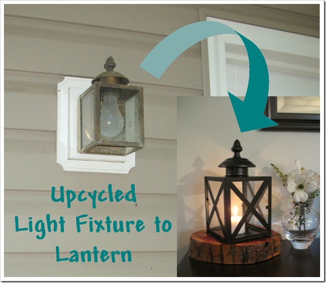
DIY Light Fixture to Lantern

IMG_6724

Last time I told you how I had big plans for the two old deck light fixtures that I replaced.  Well, that really got me inspired to work on these guys that have been sitting in the basement for a while.  That is why I love blogging.  Accountability, people!

Okay, so when I ripped these lights off the wall to replace them, (that’s not really how it went down, but I felt like ripping them down from day one… they were ugh-ly!) I happened to notice their little boxy frame with the finial on top.  Inspiration struck… they were the perfect size and shape for a cute little lantern!

Here is what I’m talking about (sans glass):

IMG_6713

Dirty, rusty, brassy?  Yes, but salvageable!  I took out the glass panes and then removed the electrical part and the back plate.  Then I gave them a good once-over with a wire brush, followed by soap and water.  Then I spray painted the box, cap, and finial oil rubbed bronze.  I saved the washer from the electrical part so I could reinstall the finial later.  Everything else I chucked in the trash. 

IMG_6714

This is the secret to my spray painting set up… spray on the red brick gravel so that when you overspray, you can just rake it into the rest and no one will notice the spray painted ones.  Riiiiiight. :)  One day when Michael comes home all the red gravel will suddenly be oil rubbed bronze.   (That’s right Brian, not the dog and cat, but the patio! hehe)

After the parts were dry, I reinstalled the cap and finial using that washer that I saved.  Glad I thought to keep it fish it out of the trash, or else I would have had to glue the pieces back together.  It’s always a good day when I can finish a project without resorting to hot glue.  :)  I put the three panes of glass back in (the light only had three because the fourth side was where it mounted to the wall), which left an opening in the back for candle insertion and ventilation.  My lantern won’t be a centerpiece this way, but as long as it’s backed up to a wall or something, it will still look good. 

Once everything was back together, I thought they looked okay, but there was something missing from the “lantern” look I was going for.  So I decided to add little cross pieces on the front of each glass pane, for a little extra detail.  I used a piece of template vinyl which I cut into one centimeter wide strips and spray painted to match.  Both sides.  Then I cut them and notched the corners so they would fit perfectly in front of the glass pane.

Lastly, I realized my lanterns had to have a bottom; I couldn’t just sit the candle on the table!  So, I had my Papa cut me a couple squares of thin sheet metal, which I promptly painted as well.  (DIYer’s dream = having parents who save everything.)  I stuck the squares inside on the bottom frame.  Add a candle and there you have it… a cute little lantern!

The hard part was trying to decide where to put them, so I tried a few places… 

IMG_6733

IMG_6740

IMG_6750

IMG_6727

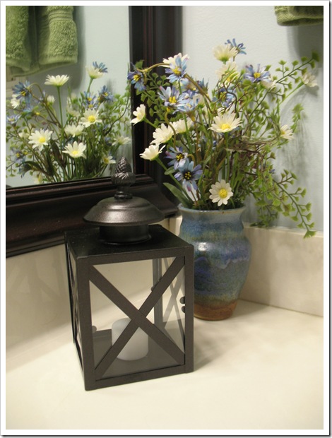
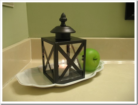
But this is where they finally ended up… for now:

IMG_6755 IMG_6721

IMG_6724

blue scroll  light to lantern

So, what do you think of my upcycled light fixture turned lantern? 

I think they will be even cuter for Autumn decor… yep, that’s where my mind is headed, it’s almost September!!

signature

Monday, August 15, 2011

Oil Rubbed Bronze to the Rescue!

I have been wanting to replace the light fixtures on the deck since we moved in.  The lights we had out there were tiny ugly brass boxes…  So, when I spied these beauties at the Habitat Restore for $15, I snatched them right up.  They were a pretty white color, but had a couple scratched places.  And they were missing some screws, but I figured they didn’t really need all six screws anyway.  :)

IMG_5325

I cleaned them up, disassembled all the parts and gave them a few coats of oil rubbed bronze spray paint.  Then Papa helped me install them on the upper and lower decks.   Ah, lovely…

IMG_5601 b

IMG_6186

Here is the before and after:

IMG_5342  IMG_5602

While I was sprucing up the light fixtures, I had to spray paint a couple more things, too.  We bought two of these plastic urns at Dollar General for my sister’s wedding back in 2008.  They were a concrete gray color:

IMG_6871

Three years later, we finally decided to spruce them up a bit.  After a couple coats of oil rubbed bronze “universal” paint (which supposedly sticks to plastic—so far, so good!) they looked like a million bucks… okay, maybe not a million, but twenty at least.  Considering they were only $8 each, I think it was a good deal for a lightweight planter urn that has lasted three years already!

Now they look right at home on my front porch, overflowing with petunias and impatiens:

IMG_6518  IMG_6525

It’s amazing what a couple cans of spray paint can accomplish.  But that’s not the end of the story!  I decided to hold on to the little brass light fixtures, since I can’t imagine someone else would want them in their current condition.  I have plans for them anyway… with a good scrub and a some paint, I think I can make them into a couple of cute little lanterns!  Stay tuned!

signature

Thursday, August 11, 2011

DIY Drum Shade Pendant Light

So, I recently decided to update the light over our kitchen table.  According to Michael, this is the interrogation light.  He feels like he is in the hot seat every time I make him sit at the kitchen table, because the harsh light shines straight down from overhead.  Not very conducive to having a relaxing meal.  We needed to do something to make it feel less like a criminal inquisition over here (ignore flowers on table, interrogators don’t use those):

IMG_4900-1

When we moved in, I thought that light was just the cutest thing, it was all fancy and “modern” and oil-rubbed bronze.  Be still my heart. :)  And it had a cute little glass shade on it.  Plus it was in the perfect spot, directly above the kitchen table.  Well, apparently, there are better things out there than this little pendant light.  Enter the world of blogging, which has opened my eyes to an array of home decorating choices I never knew before.  Like drum shades.  They are everywhere in blog land.  And I think that somewhere along the line, I started thinking they were awesome, too.  Don’t ask me why… but if you stare at something in a beautiful setting over and over, you start to find it beautiful, too.  I can’t really say, I think I am biased on this subject. 

Anyway, I thought this was the perfect place to utilize one of these fancy drum shades.  So, after seeing this tutorial at 320 Sycamore, I thought that was something I could do!  Off I went to Lowe’s to get a drum shade.  I found a nice simple white one for a mere $10, woot!  When I got home I noticed that it had a funny kind of fitter.  Which apparently is called a “slip uno” because it slips under the light bulb on a lamp and fits there without a harp or finial.  Who knew all these things had different names and functions?  I have much to learn!

image

Unfortunately, this slip uno thing was the only kind that Lowe’s had in white drum shades, and Walmart had no white drum shades.  And I was already home with my purchase, so I was determined to make it work… somehow.  And I was determined to install it before dinner.  :)

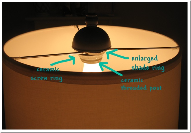
So, I decided that I could just slip the center ring thing over the ceramic threaded part of the pendant light and then tighten the ceramic ring to keep it on, which is exactly how the glass shade is secured.  Of course, the lamp shade ring was too small, and it was way down in the middle of the shade (slip uno) instead on on the top (threaded uno or spider).  So, I had to use some elbow grease (i.e. palm blisters) to reconfigure the wire fitting.  I used my pathetic wire cutters to snip the center ring off and then cut mangled it in two.  I stretched it open to make it big enough to fit over the ceramic threaded part and then bent the three metal wires up to the top broke off two of the wires and successfully bent the third metal wire up to the top.  Then I reinserted the newly enlarged center ring back into the three “spider” wires (now at a wonky angle because of the “enlargement”/mangling.  A little hot glue remedied the wires broken from the outer ring of the shade, some floral wire and scotch tape to keep all the wires in place on the center ring, and the shade fitter was fully secure (I hope!).  Next, I just placed it over the ceramic threaded post and screwed the little ring back on to hold it up.  And luckily the pendant top completely covered all my jerry-rigging.  The hardest part was getting it to sit straight on the ceramic fitter, since the shade ring was mangled into a not flat circle.  Oh me.  But it works, and it is mostly centered and mostly level.  Just don’t stare at it.  It makes it nervous. :)

IMG_6676

After all that mess, I was happy to stand back and admire my new drum shade pendant! 

I love it…  It’s the little things, people.

Maybe later when we get some more things going in the kitchen… like a paint color that is actually a color, I might fancy up the plain jane shade a bit.  With some fabric or trim that coordinates with the kitchen colors.  For now, it will just have to be white. 

IMG_6670

Here is your side-by-side comparison.  No more interrogations at the dinner table.

IMG_4904  IMG_6674 

Finally a completed kitchen project!!  After three years of living here, this room has seen very little improvement.  If I can just convince Michael to let me paint the kitchen cabinets, we could get on with the kitchen transformation.  My vision for the cabinets looks a little like this:

5996717_tYwH9LKt_c

or possibly this, in the event that Michael loses his mind and says that I can paint the cabinets yellow:

090104mup

Which one do you like?  Do you think it will look good with my new drum shade pendant?

signature