Wednesday, March 31, 2010

March Marches On…

Goodbye March.

Even though I’ve been too busy to enjoy you, March, I will enjoy these memories of your first blooms of Spring.

IMG_1976

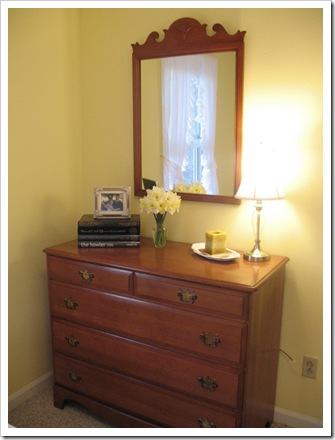
Darling daffodils, you make me smile.  And you inspired me to paint the guest room yellow, so I’ll remember your loveliness long after you are gone.

IMG_1972

    Oh Forsythia, I am so happy to see you.  When I planted you last year you were all nothing but sticks.  Now just look what you’ve become.  Maybe next year, all of you will bloom and you’ll be the star of the yard!

IMG_1982

 IMG_1983

Hi, there, you have finally opened, first tulip in my yard.  Dainty tulips, you were hard-earned.  But well worth it.  I look forward to April for the real flower show.

IMG_1985

IMG_1987

Well hello there, Mister Bleeding Heart!  You took me by surprise.  One day you were just a purple sprout, and the next day, a flourish of delicate pink blooms.  I have been waiting for you for a year.  Last year, when we got you, you were nothing but a mess of green tangles.  My patience has paid off—you are lovely.  Now don’t you go fading away anytime soon, there are other Spring blooms coming soon!


Welcome April!


signature

Wednesday, March 24, 2010

Life’s short…

EAT DESSERT FIRST! 

I bet you thought this was going to be some morose tale about life, from that title, didn’t you?

Nope.  I’m back with the last project from my jam packed Saturday of last!  Somehow I managed to find the time to do this quick little craft in between spray painting the window locks (yes, I did that!) and redecorating the guest bedroom. 

But, this project is something I showed you long ago in my photo-shopped kitchen inspiration photo.

kitchen with glass front access

Do you see it?

kitchen with glass front access

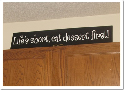
There it is!  It’s that cute sign that I simply had to have to remind me to eat my vegetables, ahem.. I mean sugar.

(And of course to annoy my husband, who for one, doesn’t really care for dessert and two, dislikes putting things on top of upper cabinets! )  I know I am evil.  Moving on.

So, I had my Papa cut me a scrap piece of wood an appropriate size for my little sage advice sign.  He routered the edges for me, too!  Thanks Papa!

Then I painted it with some semi-gloss black paint.  After I selected a lovely font (Grenouille from Dafont.com) and designed the phrase in Publisher using the banner feature,  I just sized it to fit my sign and printed an outline. Then I transferred the image to the sign with a pencil, pressing into the wood slightly to make an impression so I could see it.  Then my trusty paint pen and I went to work filling in the letters (it took about three coats). 

Ta Da!

IMG_1949

IMG_1963

And there it is in the kitchen.  Over the pink mixer.  Which is where I make all my delectable desserts.  :)  How appropriate.

I would have taken a nice wide angle shot for your before and after comparison, but someone had too much dessert and left a bunch of dishes in the sink!

Anyway, hope you enjoyed this mini update and remember to eat your dessert first, whenever possible!

signature

Monday, March 22, 2010

Guest Room Update

I am back with more pics from the grand guest room redo!

Here it is with a few more accessories.

IMG_1970

IMG_1964

IMG_1971

So, I finally got the shelf back up on the wall, albeit slightly crooked (aaargh!) and put some accessories up there.  I also added the paper lanterns until I can get more permanent wall art. 

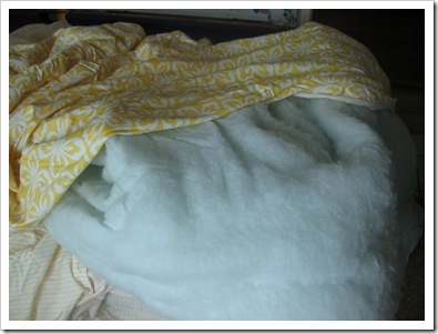
I also got new white sheets for the bed! Yay, no more blue.  And we revised the comforter that I bought.  When I went to wash the thing, it was huge and impossible to wash in a standard washing machine.  Plus, the inside filler was a lovely greenish blue color, which you could see through the fabric!

IMG_1877

I know that doesn’t look very green, but trust me, when we got it out and piled it up it was sea green!  I’m not kidding!  Where do they get this stuff?

So, in order to kill two birds with one stone, we removed the green batting and made the comforter into a duvet cover!  Then, I sewed a new duvet to go inside using muslin and white batting, not green.  And then I quilted it in rows so the strips of batting would stay put.  Here’s what I’m talking about:

IMG_1882

Not bad for an evening’s work, huh?  And just to save an extra step, instead of making a buttoned opening for the duvet to go in and out like a regular duvet cover, I just stuffed it in and stitched up the hole with a basting stitch.  Now when I want to wash it, I just rip out the stitch and throw the cover in the laundry.  Then sew it back up afterwards.  Easy peasy.  For extra fancy-ness, I added buttons to the inside corners of the cover, and button loops on the duvet.  Then I just buttoned them together so the duvet and its cover stay right where I want them, with no shifty-ness. ;)

Ah, much better.

IMG_1969

The remaining projects in here are the upholstered headboard, and the seat cushion for the cedar chest.  Throw in a few framed botanical prints, some new accent pillows on the bed and we’ll be done! :)  And eventually I’ll pick up a neat chair to go next to the dresser for an extra place to throw your coat when you come to stay in our guest room!

b and b

signature

Saturday, March 20, 2010

Golden Guest Room

This weekend, we painted the guest room!  It’s the first room that we’ve painted on the main level since we moved in, and only the third room that’s been painted in the whole house!  Gadzooks!

Anyway, my sister joined me for the major transformation from cartoon chaos!  For all of you cartoon drawing lovers, please skip the next part as it may be hard for you to read. ;)

Here is what it used to look like with Max, Clifford, Curious George, Cat in the Hat, Lorax, and their friends gallivanting across the walls…

Projects

The first day I primed over the drawings.  It only took three coats!  Haha.. those suckers did not want to go away. :)  Don’t worry, I gave each one a proper goodbye before the primer was rolled on. 

Then I had to choose a paint color.  After much deliberation (ugh!) over what shade of yellow to use, I settled on the same color from my laundry room, Olympic’s “Flax”.  It’s nice and clean, butter yellow in the daylight and warms to a golden yellow in lamplight. 

Hannah rolled the walls, while I painted trim and windows.  Here’s a few progress shots:

Projects1

Thanks Hannah!

Then, I put the room back together.  Here’s a sneak peek at the new look!  More pics coming soon after the accessorizing is complete!

IMG_1937

IMG_1939

So, what do you think of the new color? Does it look like I smeared banana pudding everywhere?  Or maybe you’d like to see it with daylight+lamplight=fluorescent highlighter yellow!  Check back soon for more updates!

signature

Tuesday, March 16, 2010

Upholstered Coffee Table Ottoman

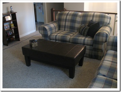
The long-awaited, much-pondered, and hard-earned upholstered coffee table ottoman is here!

IMG_1909

We’ll just call it the coftableman for short. ;)

Can you guess where our inspiration is from?  It’s Pottery Barn, of course.

My father built the solid maple wood frame to my specifications.  We made ours smaller than the PB version because we wanted it to fit in front of our loveseat.  The finished piece is 42” wide, 24” deep, and 17” high.

IMG_1424

My mom stained the frame Bombay mahogany to match the TV cabinet in the living room.  A support rail was added with slats and a platform (much like a bed frame) to support the cushion top.  We topped ours with a 6” thick piece of high density foam and wrapped it in durable vinyl.

IMG_1900

The fabric is faux leather in a fudge color.  I got it from Fabric.com.  Apparently, it’s supposed to look like bison leather?  We made a pieced pattern for the top like the PB version with the intention of adding tufted buttons where the seams meet.  After we sewed the top to the sides, and slipped it over the foam, we simply stapled it to the bottom of the plywood platform.

IMG_1901

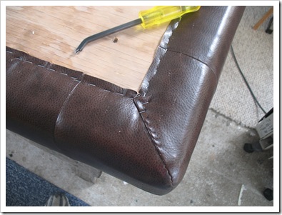
While I say “simply” it wasn’t all that simple.  After stapling it all on the first time, we laid it over the frame to have a look and realized that our support slats should have been offset to account for the thickness of the plywood platform.  There was a small gap between the legs and the foam!  Ick! 

So, instead of cutting out a space in the foam for the plywood or moving the slats down, we opted to fill in around the wood with some extra foam to make up the inch difference.  Voila! 
IMG_1906

We sewed up the corners by hand to make it look pretty. :)

IMG_1907

After pre-drilling the holes for our screws, we smushed the foam top on to the support slats, and while Mama stood on the frame, I fastened the platform to the slats with the drill!  Victory is ours!

IMG_1909

For now, we have decided to forego the tufted buttons.  That’s just another place for crumbs to fall! :)  We like it flat on top for plates and drinks.  It’s so firm that we can even sit a glass on it with no fear.  And it’s still soft enough to rest your feet on.  Plus, the vinyl finish is so easy to clean!

IMG_1910

IMG_1911

Here’s what our old coffee table looked like:

IMG_8934

Out with the old, in with the new and improved!

IMG_1908

What do you think?  Like the new look?

signature