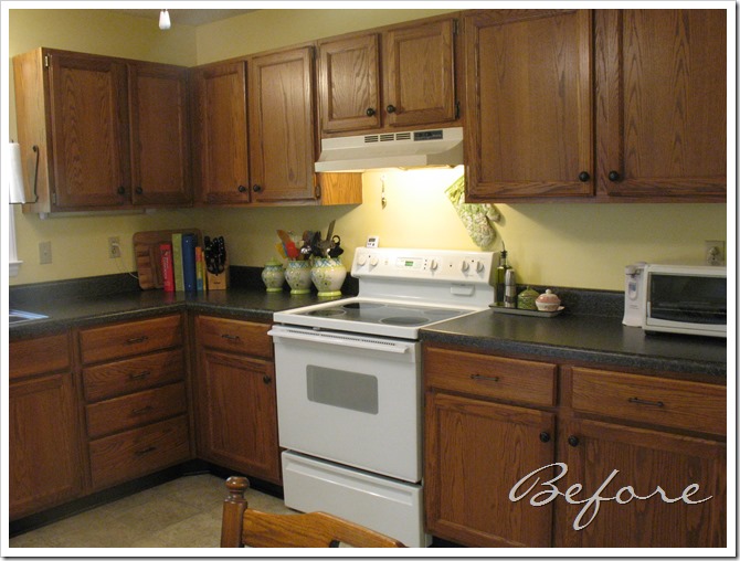
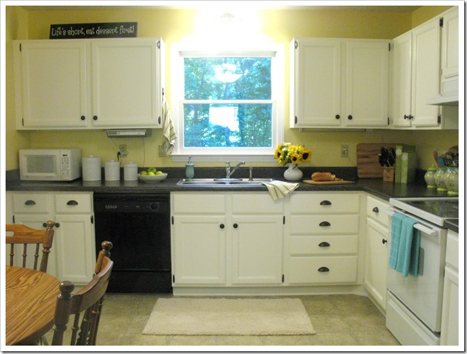
The day is here! Cue the trumpets! It may have taken 18 days but I am finally finished painting the kitchen cabinets! My Mama came this morning to help me hang the doors. And now my kitchen is ready for its big reveal… but before we begin, let me remind you what the kitchen used to look like:
Orangey and dark…
and now…
White and bright!
Ahhhh, can you handle it?
After your sneak peek on Thursday, I waited another two days before reinstalling the doors. I attached new overlay hinges to all the doors, which took FOREVER. Turns out I am kind of terrible at hinges. I almost had a mental breakdown last night when the first door I installed wouldn’t stay closed. But after a time spent googling, I discovered that I was over-tightening the outside screws. It’s a very touchy matter, installing new hinges, especially on old, warped doors. But eventually I found my groove and we were motoring right along. (I also put these little clear rubber bumpers on the insides of the doors to reduce the slamming sound when they close and also to prevent the paint from chipping at the point of contact. The new hinges actually came with little black foam bumpers but I like these better. They are clear so they are nearly invisible against the white doors. I put them on the inside of the drawer fronts, too.)
When we were finished, I climbed down from the ladder and stood back to admire the new doors. That’s when they attacked me! It was like white monsters coming at me from above! Aaaaah! But I beat them down and they receded into the background. (<—mental breakdown again?) I think after having dark cabinets all this time, and then after having the doors off for two weeks, the huge expanse of white was a little shocking to my brain. The sky is falling!!!
But I went away and when I came back (with flowers from Trader Joe’s) the cabinets and I made peace. I’m not crazy about the exposed hinges. I think the concealed ones looks mighty nice, but I didn’t want to go through the ordeal of installing those fancy ones. These lend my kitchen a little of a country farmhouse feel, which works for me! (I hope to add a beadboard island with farmhouse turned legs eventually, so that will coordinate nicely.)
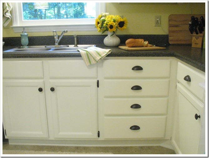
The paint finish turned out great. I definitely recommend Benjamin Moore Advance satin paint, it has a nice hard shell-like finish and is plenty shiny. I’m glad I didn’t get semi-gloss like I first planned, for I think it would have been too shiny. The color is Simply White and it’s definitely off-white, which clearly contrasts next to the white stove. It’s a little creamy which I think looks great with the oil-rubbed bronze hardware. Plus it plays off the neutral flooring nicely.
I really love the new cup pulls. I wish there was some way to put those on the cabinet doors, too, but I decided to reuse the little knobs we already had because they did not offend me like those bar pulls. :)
I even painted my kitty towel hook oil rubbed bronze to match. :)
And when I was tidying up and decluttering the cabinets, I had what my mother likes to call a “flash of an idea!” My red Betty Crocker cookbook was an eyesore in my soft yellow and green kitchen, so I decided to cover the binder with green contact paper! Eureka… am genius. It looks splendid with its green Lang counterpart there next to the knife block. And I even made little round title stickers to unify the set… it’s not as though I don’t know which is which, but they are totally cute!
So, obviously someone gave the Sarah a paintbrush (it was Sarah who gave it to her! No one else to blame!) so now she’s going to need a new rug and a new curtain. Go figure. She’s already needed new hardware and a new oven mitt, not to mention those “photo shoot flowers”. That girl is out of control!! :)
I am currently considering a Dash and Albert striped rug to go in front of the sink. This fluffy cream rug was swiped from the master bathroom for the photo shoot. But I think something like this would look swell: (Michael thinks it looks like an Easter egg??)
That’s the Dash and Albert Aquinnah rug as featured in Kate’s kitchen from Centsational Girl. She has great taste! :)
My birthday is next month, so if you’d like to give me a Dash and Albert rug that would be acceptable. ;)
Meanwhile, I am also planning to make some kind of valance for the window. I have one that I use in the winter when the trees are bare because the sun shines right on your face while you do the dishes. I took it down for the summer and now I find I am wanting a new one. Typical Sarah. :)
So my first idea was to make one from this fabric which I double heart love:
It’s Braemore Gazebo in Cloud. Look how gorgeous it is with that rug! Go, look, I’ll wait…
Here I’ll make it easy for you with this photoshopped version with valance and rug:
Yes?
We went to check it out at the fabric store today, and lo and behold it was featured in their drapery section at the front of the store all sewed up into full length panels. I skipped over and starting squealing “Oooh, Mama, this is it! This is the one I was showing you!” :) Sorry fellow shoppers… I cannot contain my excitement for botanical printed linen.
I was hoping the green would be more yellow, and there would be more blue than gray and that the print was suitably sized for a kitchen window valance. Of course it was all wrong… so I had to walk away. After perusing a few more stores and coming up empty handed, Mama and I decided that I could paint my own version of the fabric since it was just a small piece that I would need. So I bought some white fabric to use as a base for my design. I’ll let you know how it turns out! Or if it’s really bad, you’ll never hear about it again. :)
So, technically I already did a before shot at the top. but you know, I’m not going to let that suffice. Here is my favorite before and after comparison OF. ALL. TIME.
It is just so gorgeous. But what is with that black dishwasher? :) haha
I love this kitchen… is it really mine?! The only thing I don’t love is that I waited five years to do this! :)
Okay I must go tend to these photo shoot props now…
Thanks for stopping by!
P.S. For part one of this project, check out Painting the Kitchen Cabinets: A Saga.


4 comments:
you really did a beautiful job! I love how bright & fresh everything looks. What an improvement.
Truly beautiful! Love everything – from your new kitchen,You did an amazing job.
Beautiful kitchen, you have a great taste!
Kitchen cabinets mesa az. Hksarizona.com offer kitchen cabinets, kitchen sinks, bathroom vanities, range hoods etc at an affordable price. Call: (480) 912-5855. kitchen cabinets arizona
Post a Comment