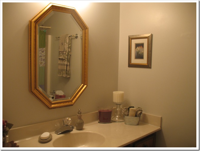
Hello! I am back with the latest updates from our guest bathroom makeover. I told you last time that we got a new mirror and light fixture to replace the funky brass ones that were left by the previous homeowners.
I like to pretend that they took all their nice, updated fixtures with them when they moved, rather than believe that they always lived with these ugly ones! Of course, I do realize that not everyone has “pretty mirror” at the top of their priorities. ;)
Anyway, I digress… onwards with the update! Remember my new light fixture (the wall color in this photo is way off, but at least you can see the light… hehe):
I installed this chrome beauty ALL BY MYSELF! And I read the directions! I know, it’s shocking. Not literally shocking, I was very careful and cut the breaker. :) I also wanted to show you what I found when I uninstalled the old light… wallpaper (and it’s hunter green… surprise, surprise)! Isn’t it nice that they saved me a little relic under there? I left it for the next person to find when they go to update my “horrible chrome light from the twenty-tens”. hehe. Maybe they’ll think I liked hunter green wallpaper with little dots, too.
Now that we have color on the walls and a beautiful new light, we can get to the real star of the room… the vanity. Remember, back in February when I asked you “to paint or not to paint?” regarding the vanity cabinets. Well, two thirds of you (thanks to my three enthusiastic voters) voted for stained mahogany cabinets with nickel knobs. That was my favorite option, too. While the off-white painted version surely would have made the room look bigger… I opted to go with a more elegant, classic look. One that complements the rest of our house, as well. And one that has nearly broken my back with effort. You know what they say: “Good things come to those who break their backs”… I mean, “Beauty is pain.” :)
So, to begin with, I took an antique oak mirror and stripped the bad paint job. Then we applied four coats of Bombay Mahogany polyshade (stain plus poly), followed by a protective polyurethane layer to seal the deal.
We took it from this grunginess:
To this beauty:
For the bargain price of $25 plus the cost of stain, I think it’s a pretty good deal for a thick, durable (read: heavy!) mirror with a solid wood frame. And doesn’t it looks snazzy on the new green walls? I’m in love! I would have liked to hang it horizontally like in my inspiration photo:
But, my steal of a deal mirror was a bit too small to accommodate both me (short) and Michael (tall). That’s the reality of living with tall husbands (right, Andi?). I don’t think Michael would appreciate having his head cut off in the mirror. :) Ultimately, I think it looks nice hanging vertically, and gives me a better view of my outfit, too! :)
Here is the unremarkable mirror before, with unremarkable cream walls:
And here is the fresh, elegant after:
LOVE.
Okay, that brings you up to date on the progress in here. I’ll be back (hopefully soon) with the rest of the reveal—mahogany stained cabinets! Yippee! Plus hand painted art and a custom shower curtain (since apparently no one sells shower curtains lovely enough for my bathroom). Stay tuned!


1 comments:
The things we have to do for our tall husbands, huh? Although Nick would say it's the opposite -- he has to reach most of the items from the tall kitchen cabinets for me! ;-)
I understand about the shower curtain. It took us weeks to find a shower curtain that wasn't too tacky! Maybe this is a niche market that you should investigate for Guthrie Designs??
Post a Comment